AtliQ Grands owns multiple five-star hotels across India. They have been in the hospitality industry for the past 20 years. Due to strategic moves from other competitors and ineffective decision-making in management, AtliQ Grands are losing its market share and revenue in the luxury/business hotels category.
As a strategic move, the managing director of AtliQ Grands wanted to incorporate “Business and Data Intelligence” to regain their market share and revenue.
In this article, we present a comprehensive Power BI dashboard designed to provide actionable insights and help AtliQ Grands regain its position as a leader in the luxury hotel market.
Dashboard Overview:
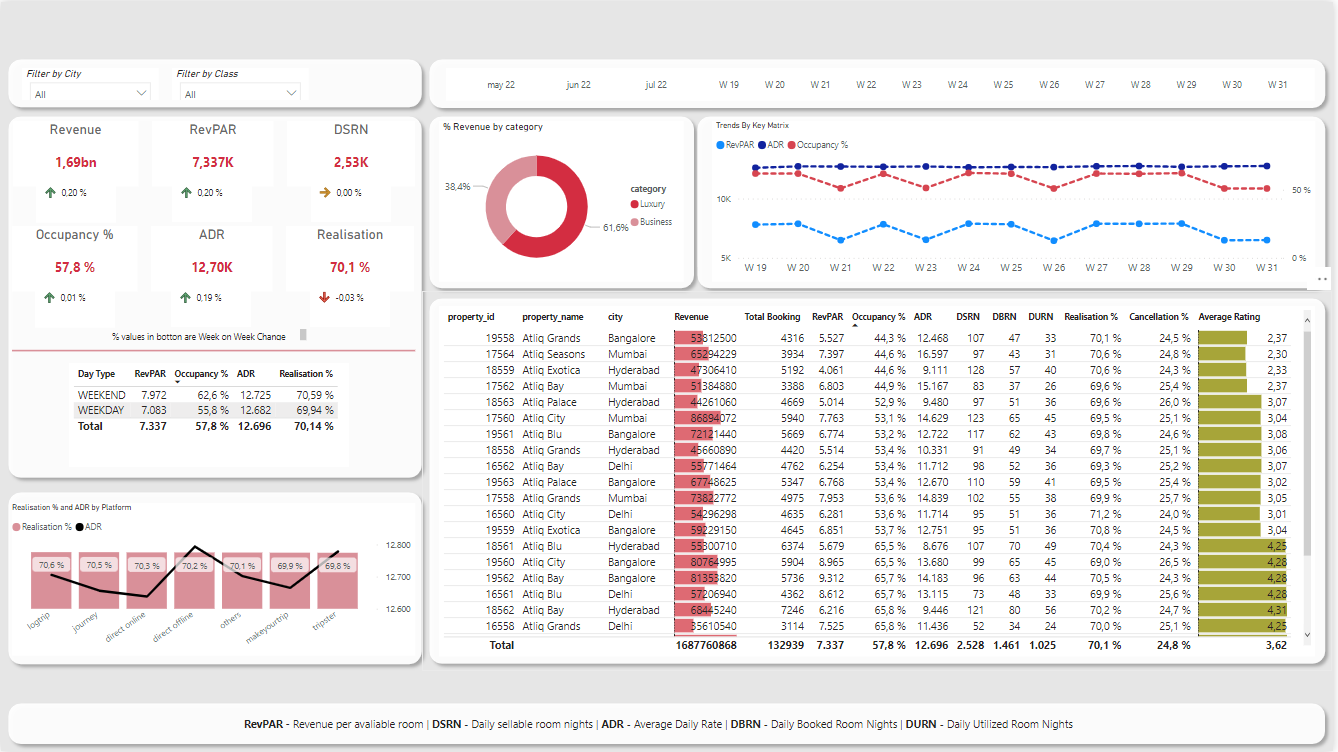
The Power BI dashboard incorporates various KPIs and measures to analyze AtliQ Grands' performance across their hotel properties. It offers a holistic view of the business operations, enabling data-driven decision-making for improved performance.
Key Measures and Insights:
- ADR, Occupancy Rate, and RevPAR: These key performance indicators provide insights into the average daily rates, overall occupancy, and revenue per available room. By monitoring these metrics, AtliQ Grands can identify trends and make informed pricing decisions.
- Booking Percentages by Class and Platform: These measures offer a detailed view of the popularity of different room types and booking sources, enabling AtliQ Grands to optimize their marketing strategies and room offerings.
- Cancellation and No-Show Rates: Monitoring these rates allows AtliQ Grands to identify potential issues with the booking process and improve customer satisfaction by addressing concerns.
- Week-Over-Week Changes: The dashboard tracks week-over-week changes for various performance indicators, such as DBRN, DSRN, occupancy, realization, revenue, and RevPAR, offering insights into emerging trends and areas for improvement.

An HR dashboard is a dynamic overview of the most important HR metrics in one place.
The HR dashboard provides a slice-and-dice overview of the workforce, their performance, absence, and turnover.
It is key for strategic decision-making in HR.
Reporting on the workforce is one of HR's essential tasks. When done right, it offers three key benefits for both HR and management:
- HR Monitoring. Regular reporting enables HR to keep a finger on the pulse of the organizations by tracking key workforce metrics. New trends and opportunities can be spotted early on and emerging problems can be addressed before they significantly impact the business.
- Management information. A human resources report can also help managers in doing their job better. An HR report can inform managers about relevant developments in their teams and department. When, for example, the marketing department struggles with high turnover and a high time-to-hire, managers will be more likely to put emphasis on retaining employees and will be aware of risks like longer replacement times when someone is about to leave.
- Track problem areas. HR reporting also offers a great way to track key problem areas in a transparent way. Transparency in turnover rates per manager will encourage them to pay closer attention to retaining employees because their own reputation is on the line! By tracking problem areas, HR can leverage its position to drive improvements.
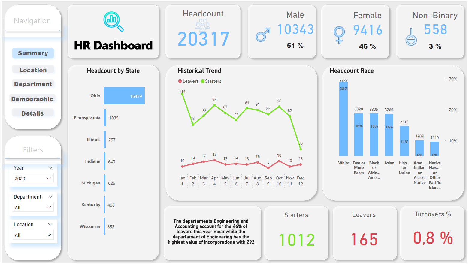
Based on the above and given the data, a 5-page dashboard was created for HR monitoring with some key tracking workforce metrics such as the headcount in every area or what the diversity present in the company is, either in terms of gender or race.
It is also worth mentioning some important variables for Management, such as turnover, starters, etc.
The filters and charts used in the dashboard fulfill the need for details to find areas for improvement and places with critical metrics.

Managing a call center means being dialled into your current performance and metrics. The objective must be to reduce handling time, meet service level agreements, and increase customer satisfaction.
A call center dashboard allows you to keep tabs on all your metrics while delivering the highest quality of service to your client.
A Call Center Dashboard is a reporting tool that displays call center metrics and KPIs to allow managers and teams to monitor and optimize performance.
The visual display is intended to simplify analysis — reducing the time to consume information from hours to seconds.
With a dashboard displayed on a TV, teams should be able to understand their performance at a glance.
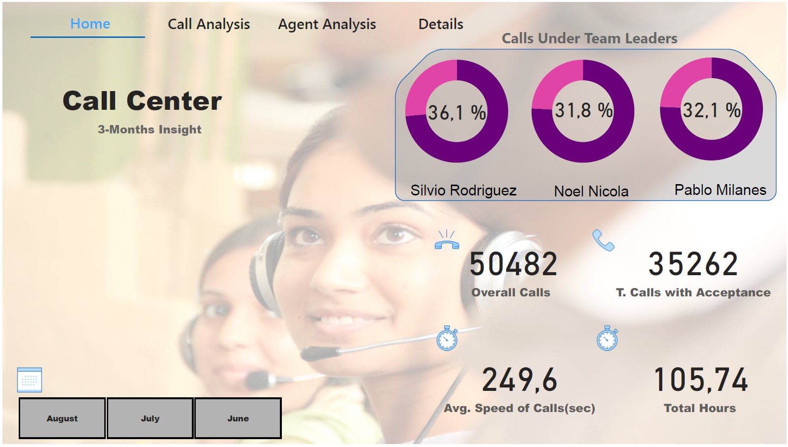
This Call Center Dashboard presents control metrics necessary to know the performance in the months of June to August for a Call Center. There are 4 pages where the filters and graphs will allow us a detailed access to the data.

The World Athletics Championships (until 2019 known as the World Championships in Athletics) are a biennial athletics competition organized by World Athletics (formerly IAAF, International Association of Athletics Federations).
Alongside the Olympic Games, they represent the highest level championships of senior international outdoor athletics competition for track and field athletics globally, including marathon running and race walking.
Separate World Championships are held by World Athletics for certain other outdoor events, including cross-country running and half-marathon, as well as indoor and age-group championships.
The World Championships were started in 1976 in response to the International Olympic Committee dropping the men's 50 km walk from the Olympic programme for the 1976 Montreal Olympics, despite its constant presence at the games since 1932.
The IAAF chose to host its own world championship event instead, a month and a half after the Olympics. It was the first World Championships that the IAAF had hosted separate from the Olympic Games (traditionally the main championship for the sport).
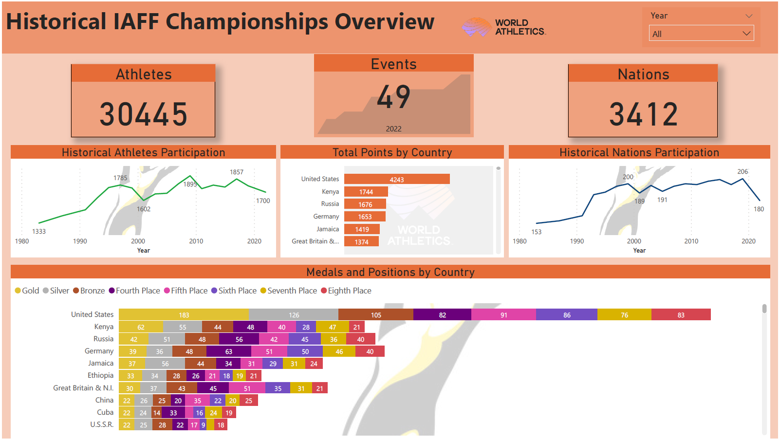
In this Dashboard, a simple historical analysis of the World Athletics Championships is carried out, from the positions of each country to the number of athletes.
Although the dashboard has only one page, the most interesting aspect of the project was obtaining the data, using scripting techniques from Python to obtain the links and create an excel with them, up to the use of a custom function to extract the data from and for Power BI.
